B2B
Enterprise
Design System
Branding
Accessibility
Designing a Scalable Brand & Design System for VTech Engineering
Designing a Scalable Brand & Design System for VTech Engineering
Role
Role
Lead designer
(end-to-end)
Lead designer
(end-to-end)
Duration
Duration
12 Weeks
12 Weeks
Scope
Scope
Rebranding +
Design System
Rebranding +
Design System

As VTech Engineering transitioned from a regional service provider to a precision-focused consultancy, their brand and digital assets struggled to scale with the business.
As VTech Engineering transitioned from a regional service provider to a precision-focused consultancy, their brand and digital assets struggled to scale with the business.
——-
——-
I redesigned the identity and built a modular design system grounded in engineering principles creating a structured, reusable foundation that improved consistency, accelerated asset creation, and reinforced their position as a technically credible enterprise partner.
I redesigned the identity and built a modular design system grounded in engineering principles creating a structured, reusable foundation that improved consistency, accelerated asset creation, and reinforced their position as a technically credible enterprise partner.
Efficiency
Efficiency
40% faster
asset creation
40% faster
asset creation
Accessibility
Accessibility
WCAG 2.1 AA
compliant across all
digital touchpoints
WCAG 2.1 AA
compliant across all
digital touchpoints
Scalability
Scalability
Scalable multi-brand
architecture for future
growth
Problem
Problem
1.
Inconsistent visual system
No grid or structure → distortion across formats
2.
Lack of technical credibility
Didn’t reflect engineering precision
3.
Operational inefficiency
No standards → slow, inconsistent execution
Challenge
Challenge
Design a system that reflects technical rigor and scales across teams and platforms.
Design a system that reflects technical rigor and scales across teams and platforms.
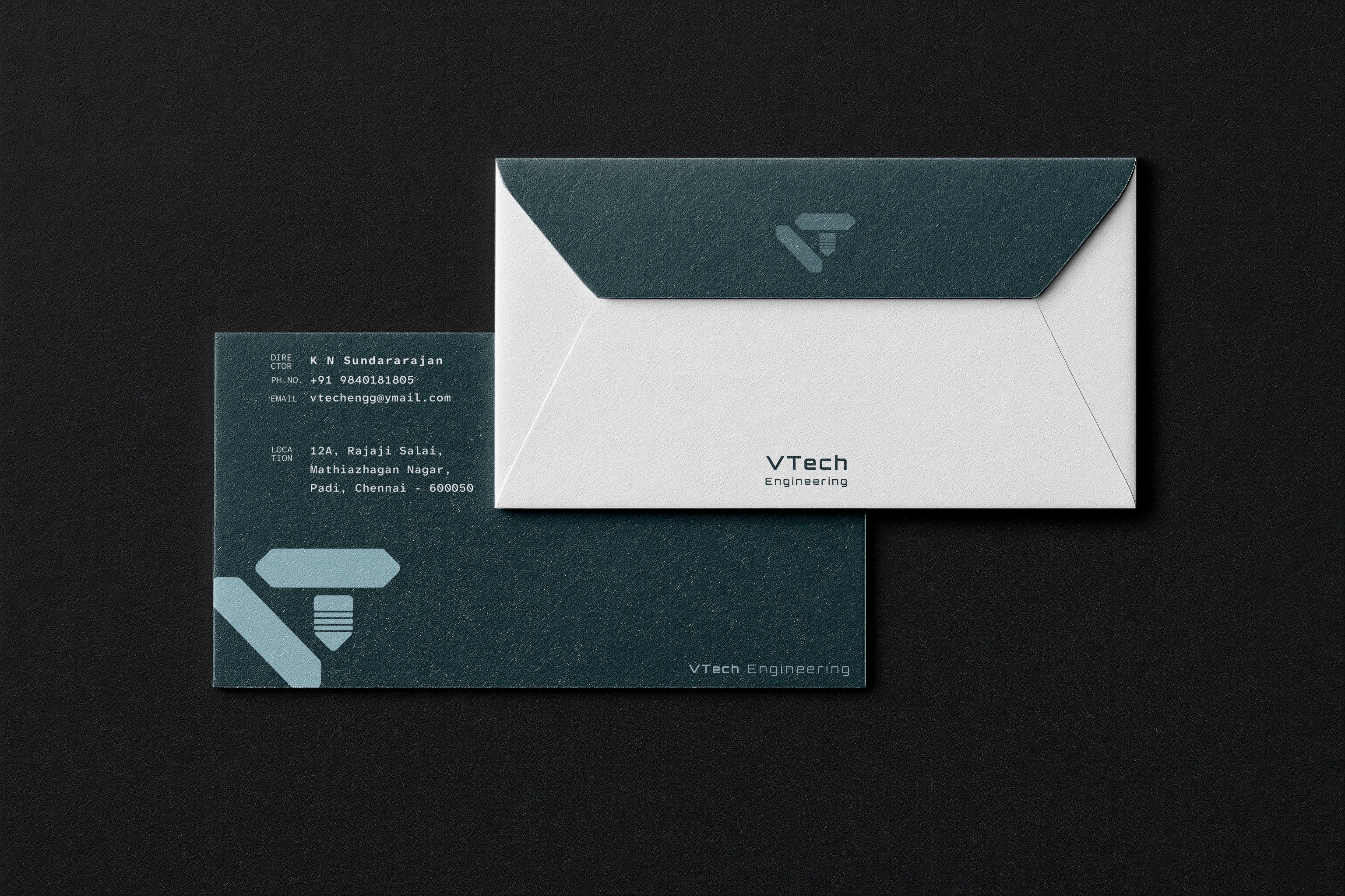
VTech
VTech
VTech
Logo system
The "Validation" Glyph
The negative space in the “V” forms a subtle checkmark, signaling validation, quality assurance, and engineering precision.
The negative space in the “V” forms a subtle checkmark, signaling validation, quality assurance, and engineering precision.
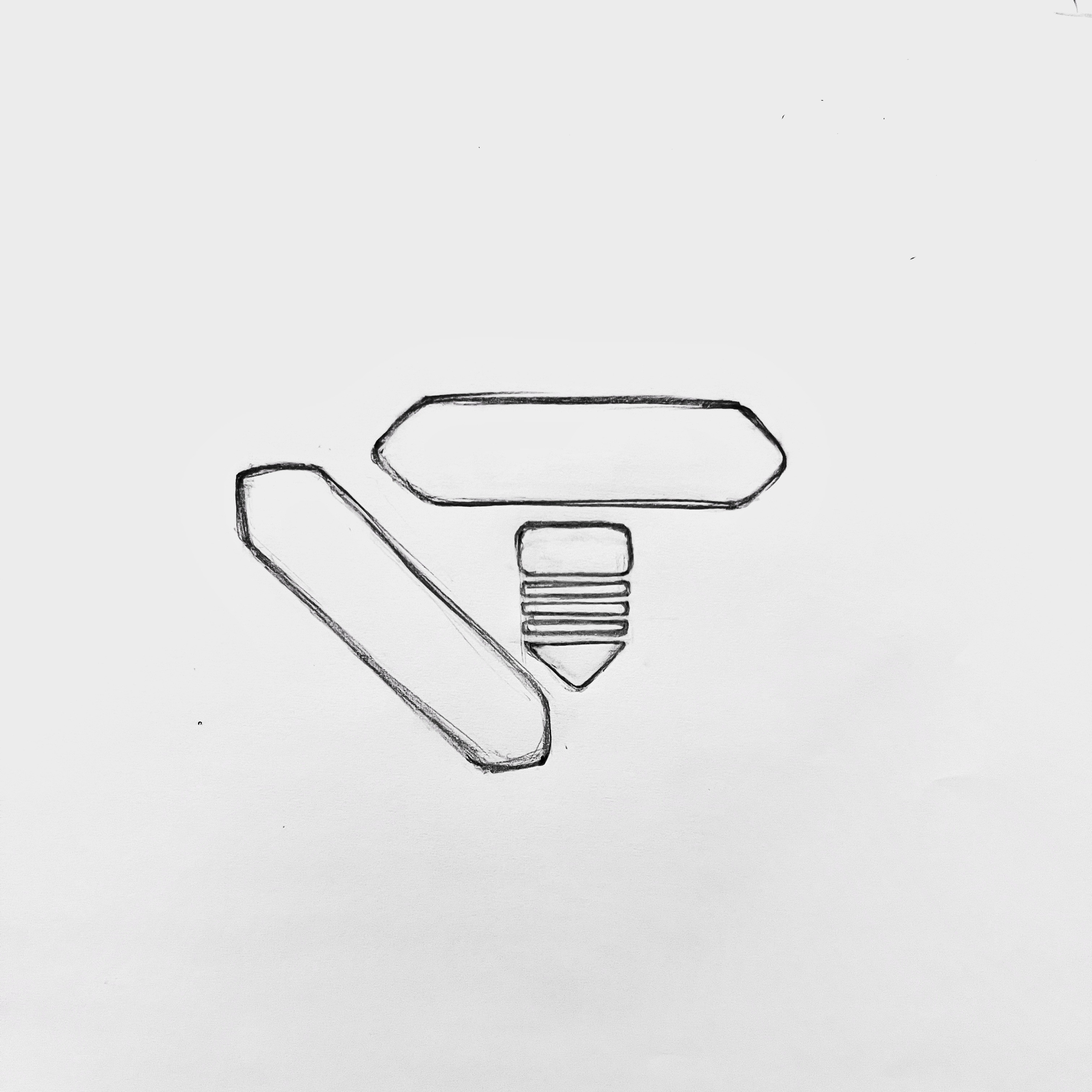
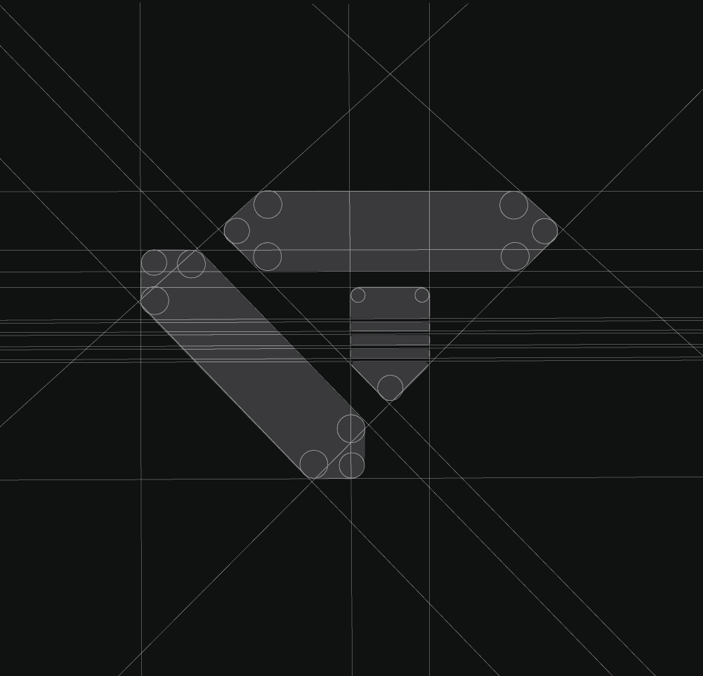
The 60° Angle Rule
The primary strokes are locked to 60° angles, mirroring the standard isometric perspective used in CAD and architectural drafting.
The primary strokes are locked to 60° angles, mirroring the standard isometric perspective used in CAD and architectural drafting.
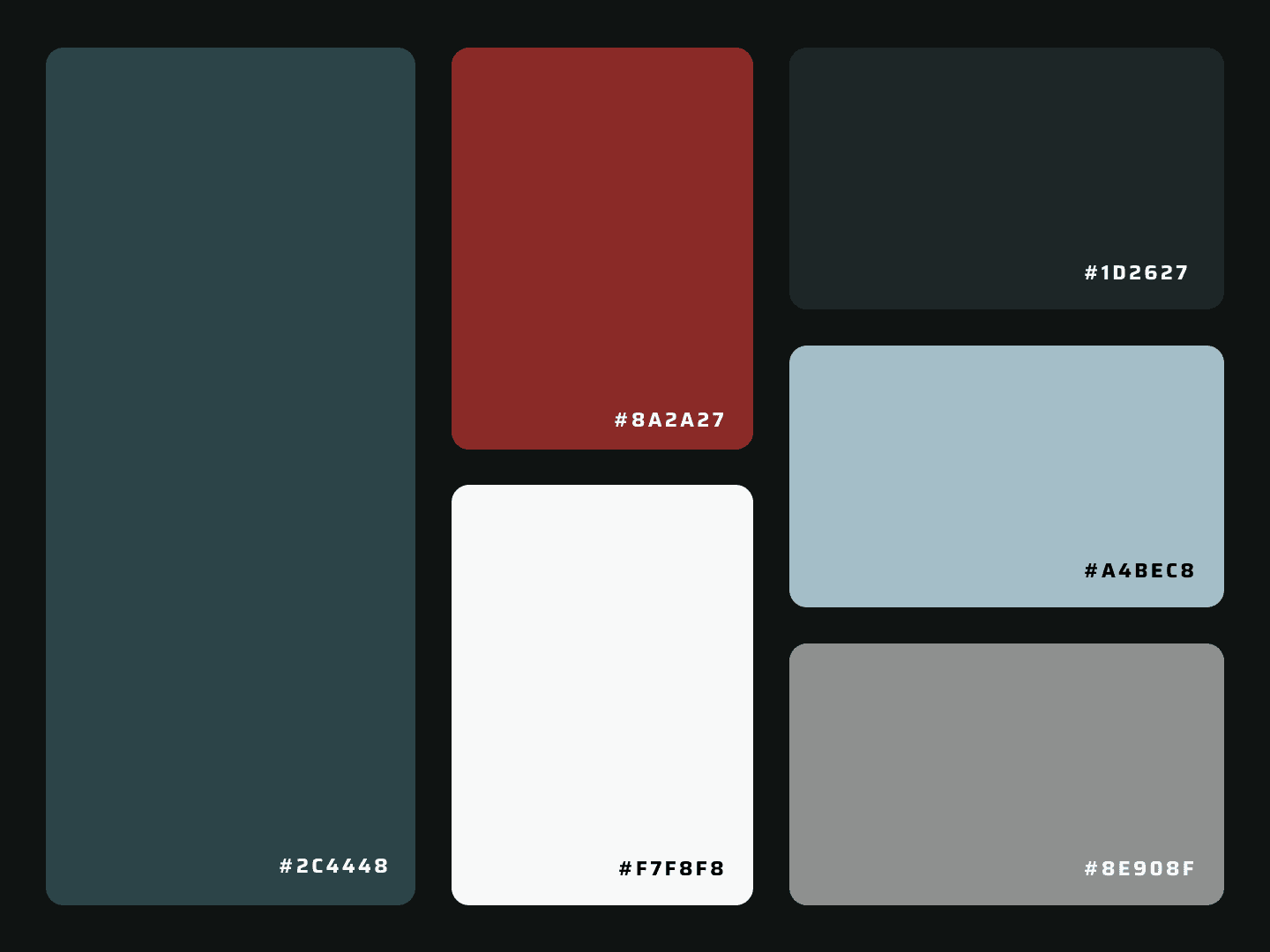
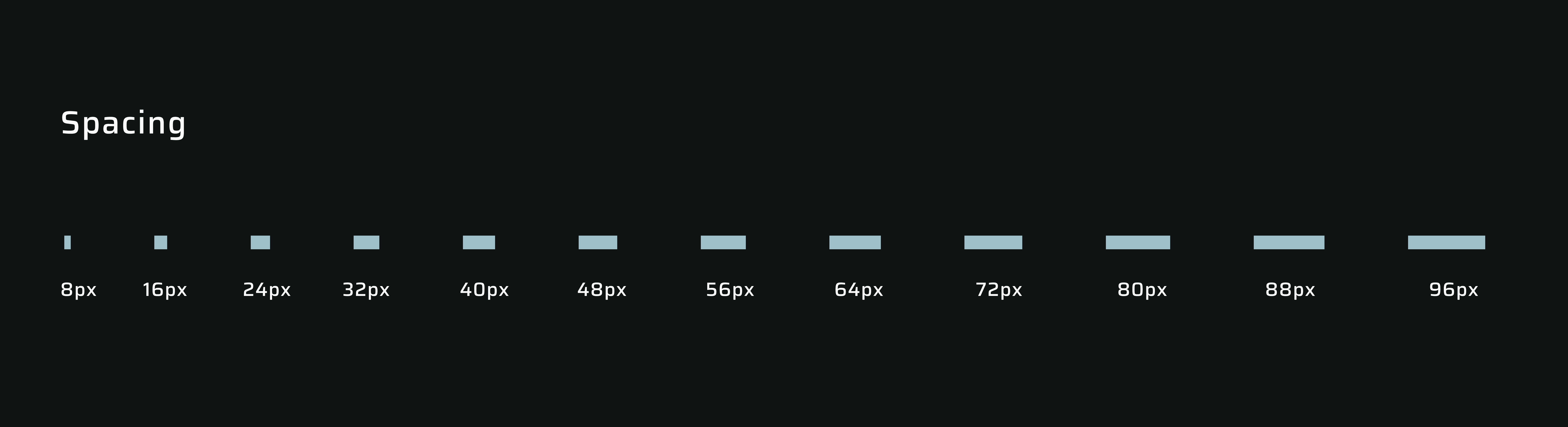
System foundations

High-fidelity implementation


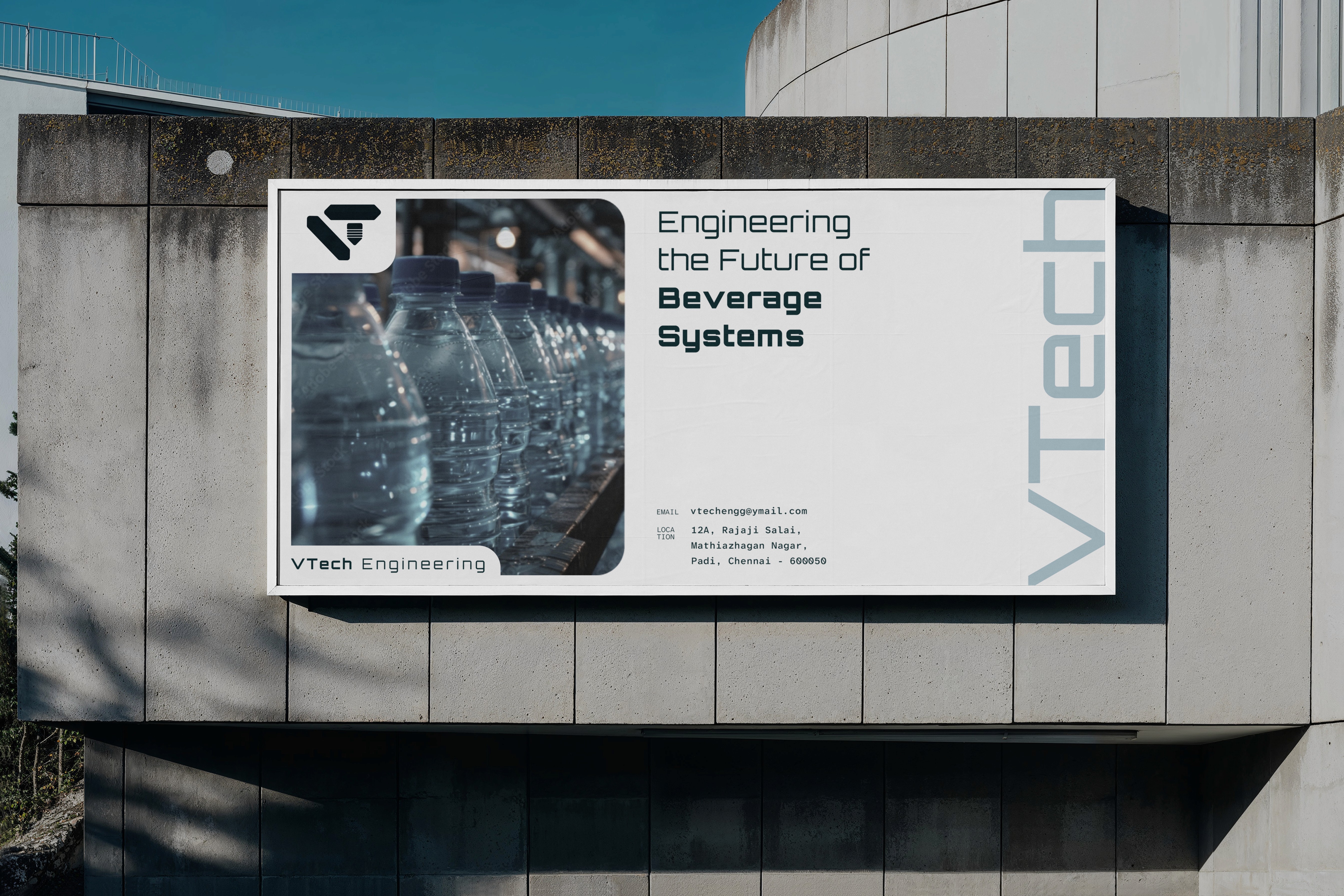
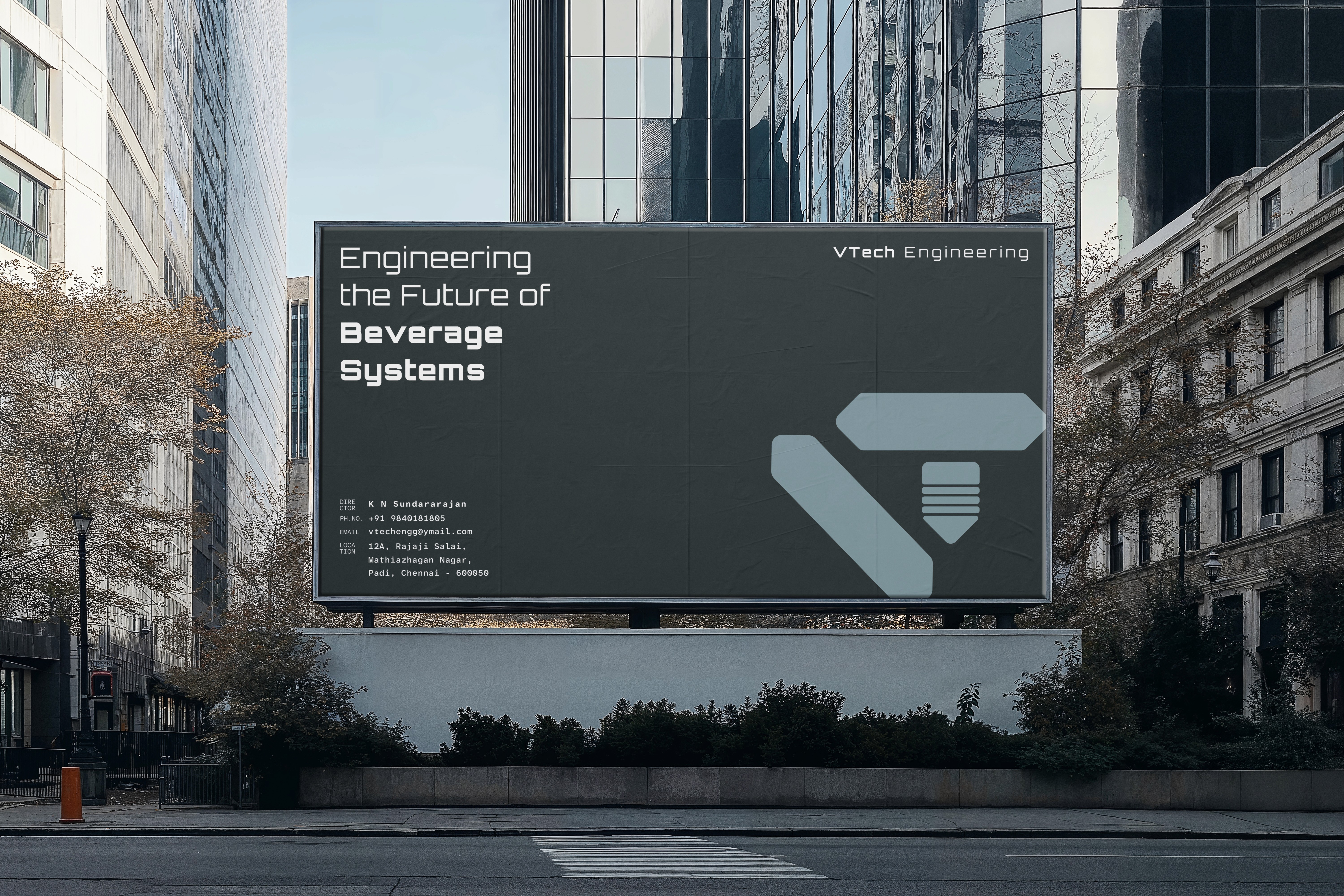

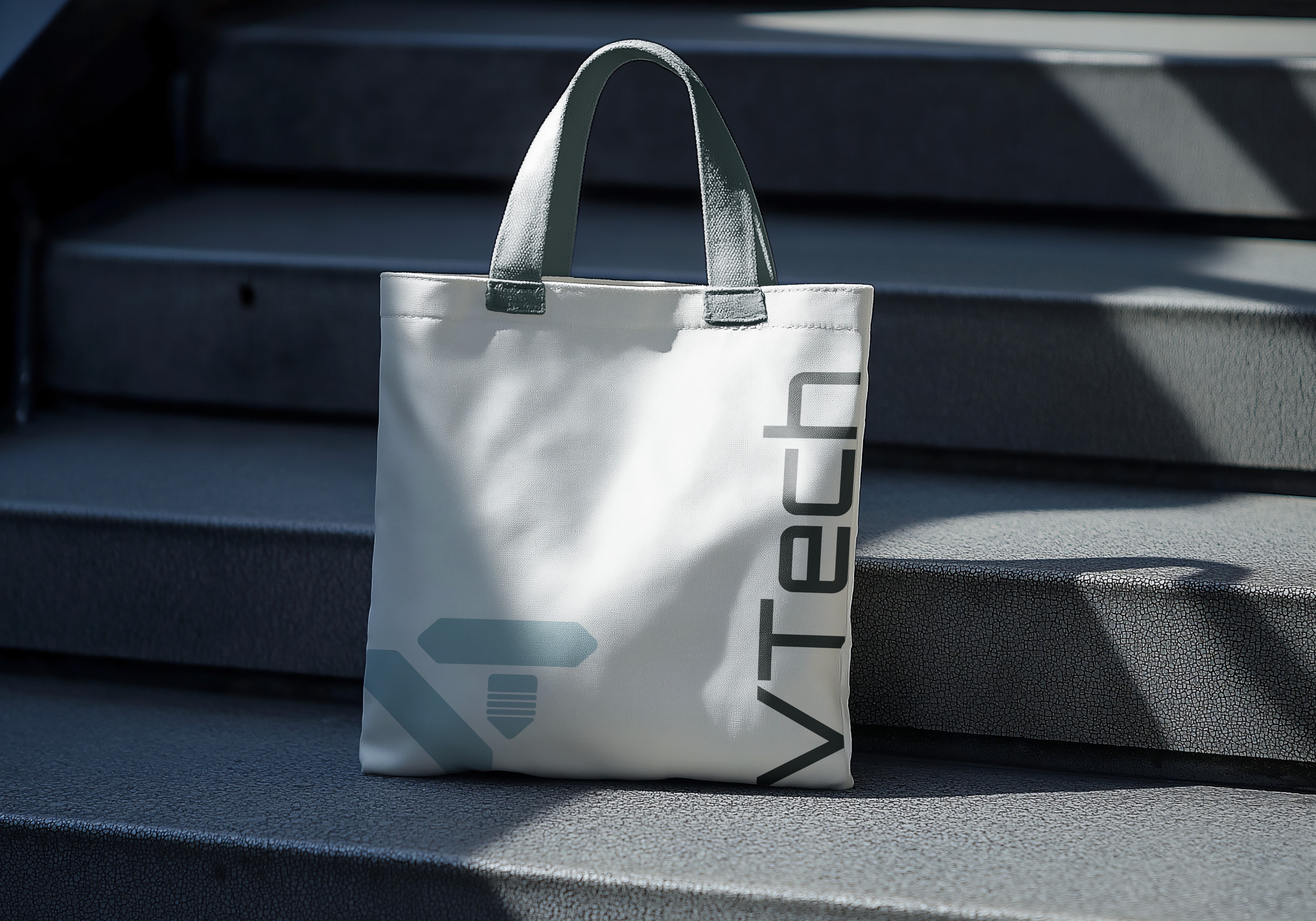

Designing for scale
I built a token-driven design system with reusable standards to ensure consistency at scale.
I built a token-driven design system with reusable standards to ensure consistency at scale.
The system ensures consistent implementation across digital, print, and industrial environments, reducing cross-team inconsistency and drift
The system ensures consistent implementation across digital, print, and industrial environments, reducing cross-team inconsistency and drift
Semantic States
Defined system colors for error, warning, and success to support quick, text-independent status recognition.
Accessibility by
default, not by
exception.
Accessibility by default, not by exception.
Accessibility by
default, not by
exception.
System constraints
Color tokens meet ≥ 4.5:1 contrast (validated with Stark)
Minimum 16px body text with an accessible type scale
Components include visible focus states and 44×44 px touch targets
Patterns avoid color-only communication
Color tokens meet ≥ 4.5:1 contrast (validated with Stark)
Minimum 16px body text with an accessible type scale
Components include visible focus states and 44×44 px touch targets
Patterns avoid color-only communication
Impact
01
01
Token-based system structured for use across 12+ touchpoints
02
02
Reduced asset creation time by ~40% through reusable templates and standards
03
03
Improved consistency across internal teams and external vendors
04
04
Color system meets WCAG 2.1 AA accessibility requirements
05
05
Multi-brand architecture designed to support future subsidiaries
01
Token-based system structured for use across 12+ touchpoints
02
Reduced asset creation time by ~40% through reusable templates and standards
03
Improved consistency across internal teams and external vendors
04
Color system meets WCAG 2.1 AA accessibility requirements
05
Multi-brand architecture designed to support future subsidiaries
Impact

Key Takeaway
Key Takeaway
For industrial and enterprise contexts, design must function as a system structured, precise, and scalable. Translating brand principles into operational standards enabled consistent execution and long-term growth.
For industrial and enterprise contexts, design must function as a system structured, precise, and scalable. Translating brand principles into operational standards enabled consistent execution and long-term growth.